Case study: Branding and packaging
Case study: Branding and packaging

SUNA is on a quest to revolutionise the dairy industry in Cameroon, Africa. I worked with the owner, a serial entrepreneur to engage audiences with fresh dairy products and expand their offerings to include farm food items produced locally.
SUNA is on a quest to revolutionise the dairy industry in Cameroon, Africa. I worked with the owner, a serial entrepreneur to engage audiences with fresh dairy products and expand their offerings to include farm food items produced locally.
Current competitors used powdered milk to produce dairy products such as yogurt and ice cream. The dairy produced at SUNA was of higher quality than competitors as SUNA had imported Jersey cows. These types of cows produce the creamiest milk. Using its own dairy factory and farm SUNA branched out into other food markets such as preserves and honey.
Setting the brand stage
Setting the brand stage
Market research showed women with surplus income were the ideal target audience as they were heralded as the gatekeepers to household food purchases. Women were also shown to make healthier food purchases and as SUNA's dairy products were made from fresh dairy as opposed to powered it was clearly the better option from a health perspective.
Market research showed women with surplus income were the ideal target audience as they were heralded as the gatekeepers to household food purchases. Women were also shown to make healthier food purchases and as SUNA's dairy products were made from fresh dairy as opposed to powered it was clearly the better option from a health perspective.
SUNA was keen to have a french patisserie, 'artisan' feel to the brand as well as appealing to women, it needed to have an international feel that reflected its premium nature. SUNA priced its products above the local competitors and so the brand needed to reflect the high-end quality and the high-end price tag. SUNA stipulated the brand needed to reflect contemporary international aesthetics, innovation, freshness, and its revolutionary approach. It was also important the main brand logo stood out on the shelf.
SUNA was keen to have a french patisserie, 'artisan' feel to the brand as well as appealing to women, it needed to have an international feel that reflected its premium nature. SUNA priced its products above the local competitors and so the brand needed to reflect the high-end quality and the high-end price tag. SUNA stipulated the brand needed to reflect contemporary international aesthetics, innovation, freshness, and its revolutionary approach. It was also important the main brand logo stood out on the shelf.
"Working with Rachel on branding, packaging, and marketing for my business startup has been a great experience from start to finish. Her approach is very thorough and personal, wanting to engage with our aspirations for the business and to bring that to life with well-researched ideas. Her designs met and exceeded the brief and I felt fully engaged throughout the process. I have already recommended her services and continue to do so."
"Working with Rachel on branding, packaging, and marketing for my business startup has been a great experience from start to finish. Her approach is very thorough and personal, wanting to engage with our aspirations for the business and to bring that to life with well-researched ideas. Her designs met and exceeded the brief and I felt fully engaged throughout the process. I have already recommended her services and continue to do so."
Mr Ngufor, SUNA Director
The approach
The approach
Research
After extensive discussions with SUNA, I immersed myself in research. Fortunately, I was visiting Sri Lanka at the time, and my client informed me that the dairy packaging would be similar to that in Cameroon. I used this insight, along with online research into competitors and market research findings, to understand the market. I also studied international brands like Unilever.
Analysis and concepts
SUNA was to be the umbrella brand for all the products and likely to have sub-brands in the future. I delved deep into the patisserie aesthetics. Once the research was complete I analysed the findings and began sketching up concepts. Narrowing these concepts down to the best representation of the brief I presented three options to SUNA. There were some minor iterations and the final logo and brand assets were produced.
Implementation
Armed with the brand elements I was commissioned to design the packaging for the ice cream and the yoghurt ranges. I took the same approach here, researching these products from competitors to the wider market, analysing my findings, sketching up ideas, and presenting three options for each and then minor iterations to produce the final printed packaging.
How the design reflects the brief
and engaged audiences
How the design
reflects the brief and engaged audiences
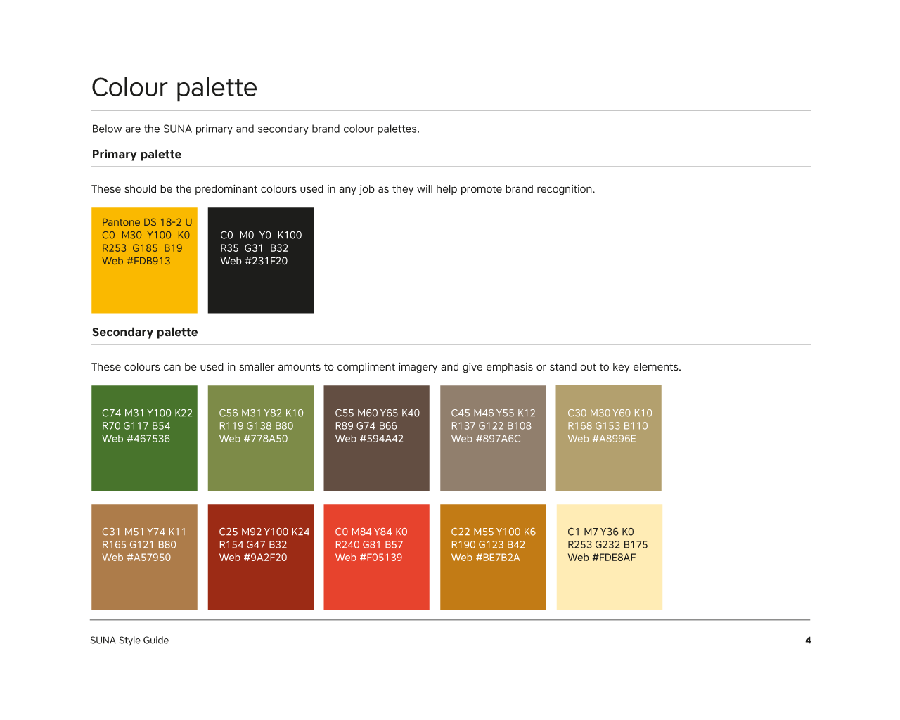
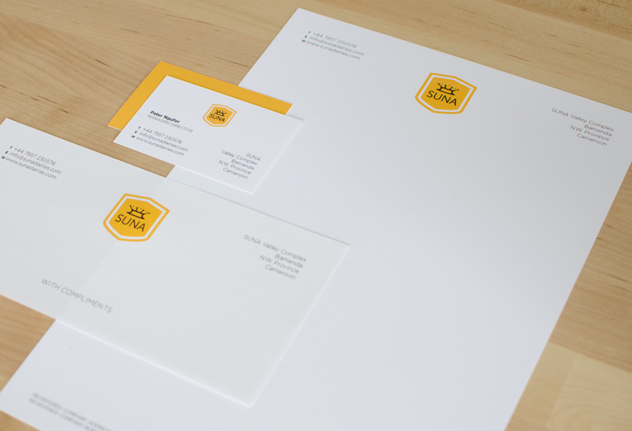
The logo
Yellow and black are the most legible colours to work with. They create the ideal stand-out-from-the-shelf colours that SUNA was after. In researching cream I discovered a very beautiful aesthetic when the cream was disturbed and created a splash, beautiful thick droplets would ascend into the air. When captured on camera it created a crown-like effect. This reflected the high-end nature of the company by visually showing a crown made out of cream, the creme de la creme of dairy producers if you like. As a new brand and product line, SUNA needed to appear trustworthy and credible. This lead me to the shield graphic which was a minimal way of securing the cream crown whilst adding value through emulating trustworthiness.
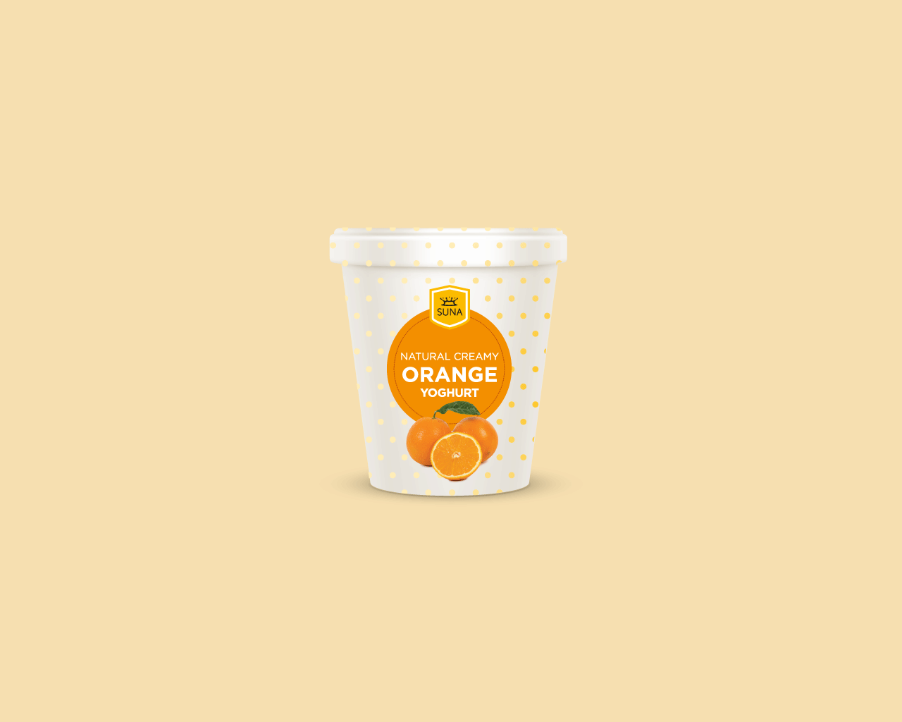
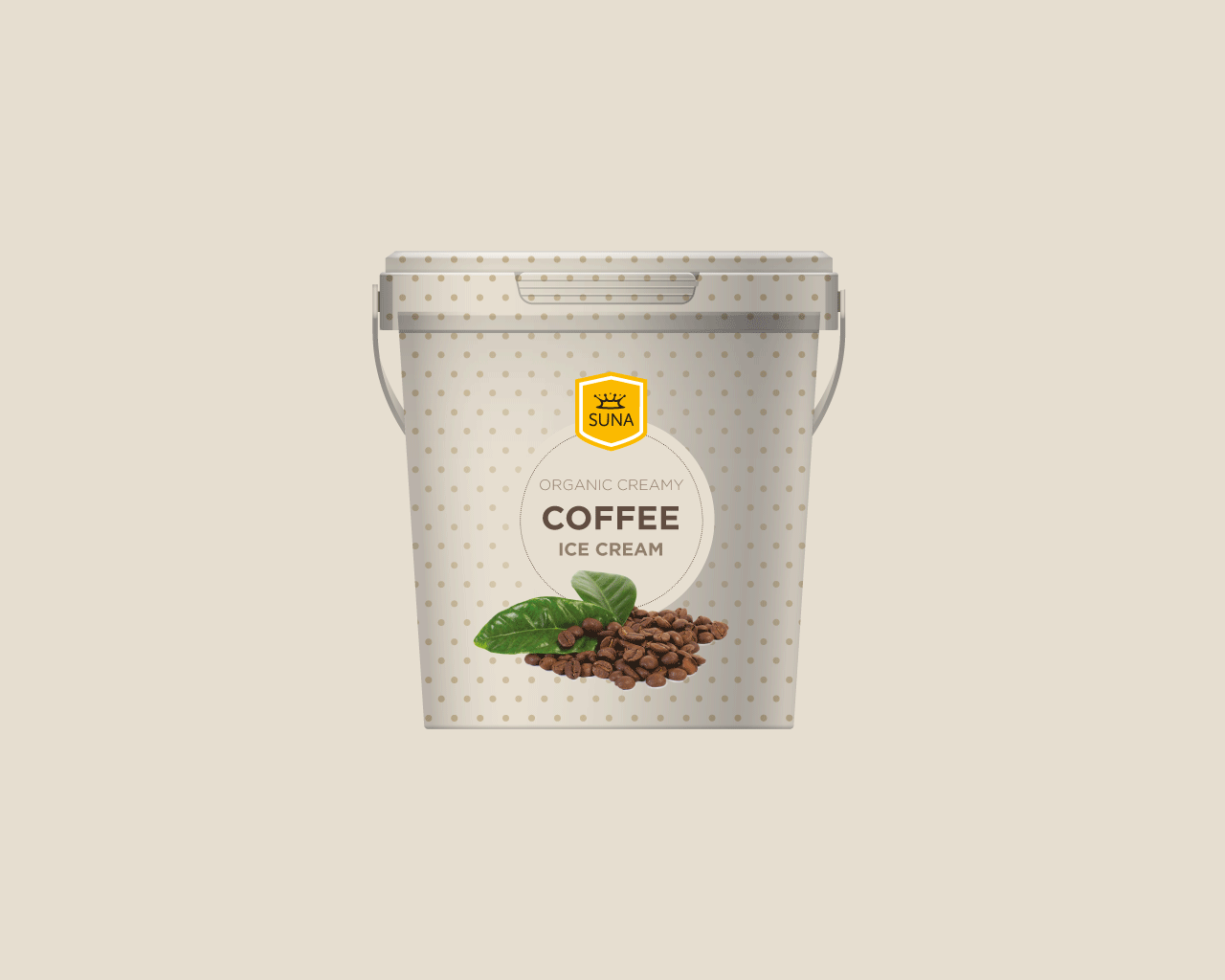
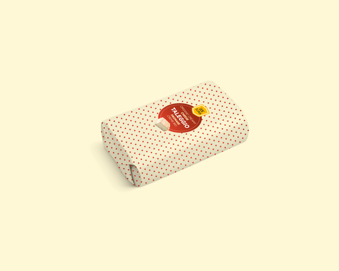
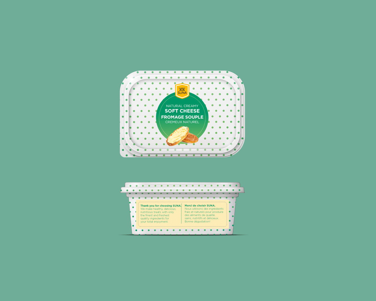
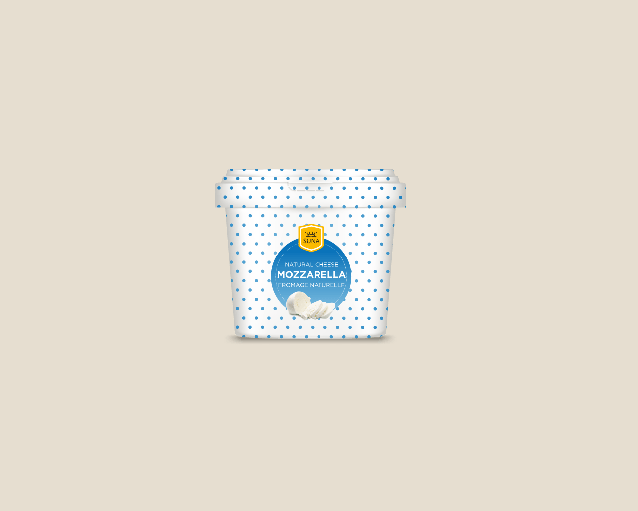
The ice cream, yoghurt, and cheese packaging
Here we see the brand come into its own through artisan patisserie style. Supporting the logo a pattern of dots and accent colours bring the style together. Curves and circles are appealing to the eye, circle's are reflective of nature as they are naturally occurring shapes. The use of real fruit and produce emulates the freshness of SUNAs offering. The recurring pattern was to become synonymous with the SUNA brand. They were used as the backdrop across dairy products creating a cohesive brand image. There were six yoghurt and icecream flavours, a smoothie cup, three conserves and three cheeses.
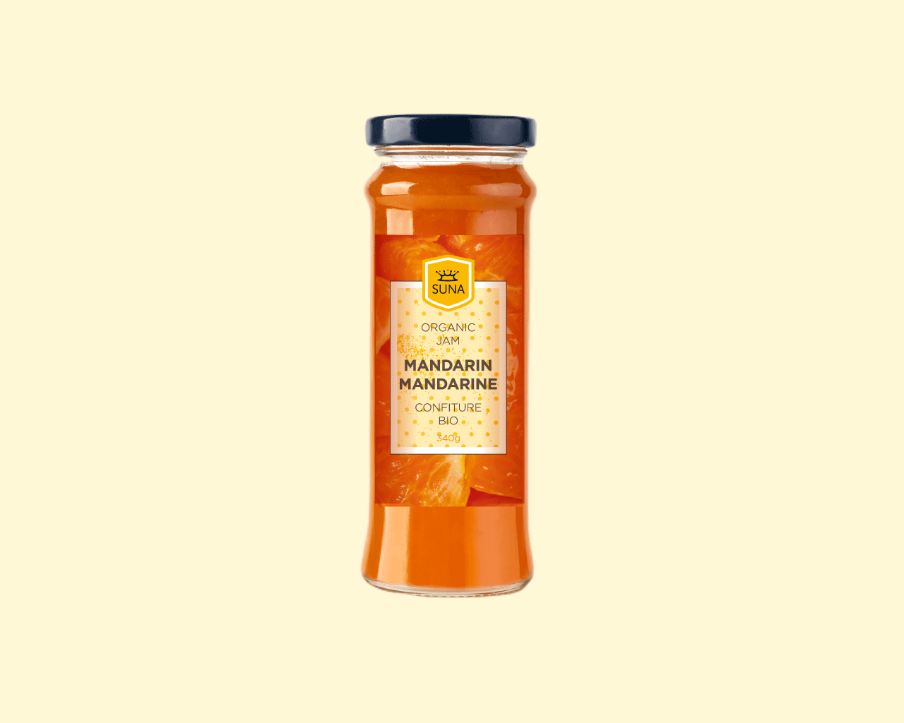
The preserves labels
There were an array of fruits being produced on the farm from guava to mandarins. These labels took a slightly different approach focusing on the magnitude of fresh fruit used in the jam-making process. I art directed a photo shoot for all the fruit and produce to ensure the juiciest images were captured. These form the background of the labels showing the consumer the step before the jam is made. The patterned dots is used here in the inner layout to create consistency across the brand and depth to the label.
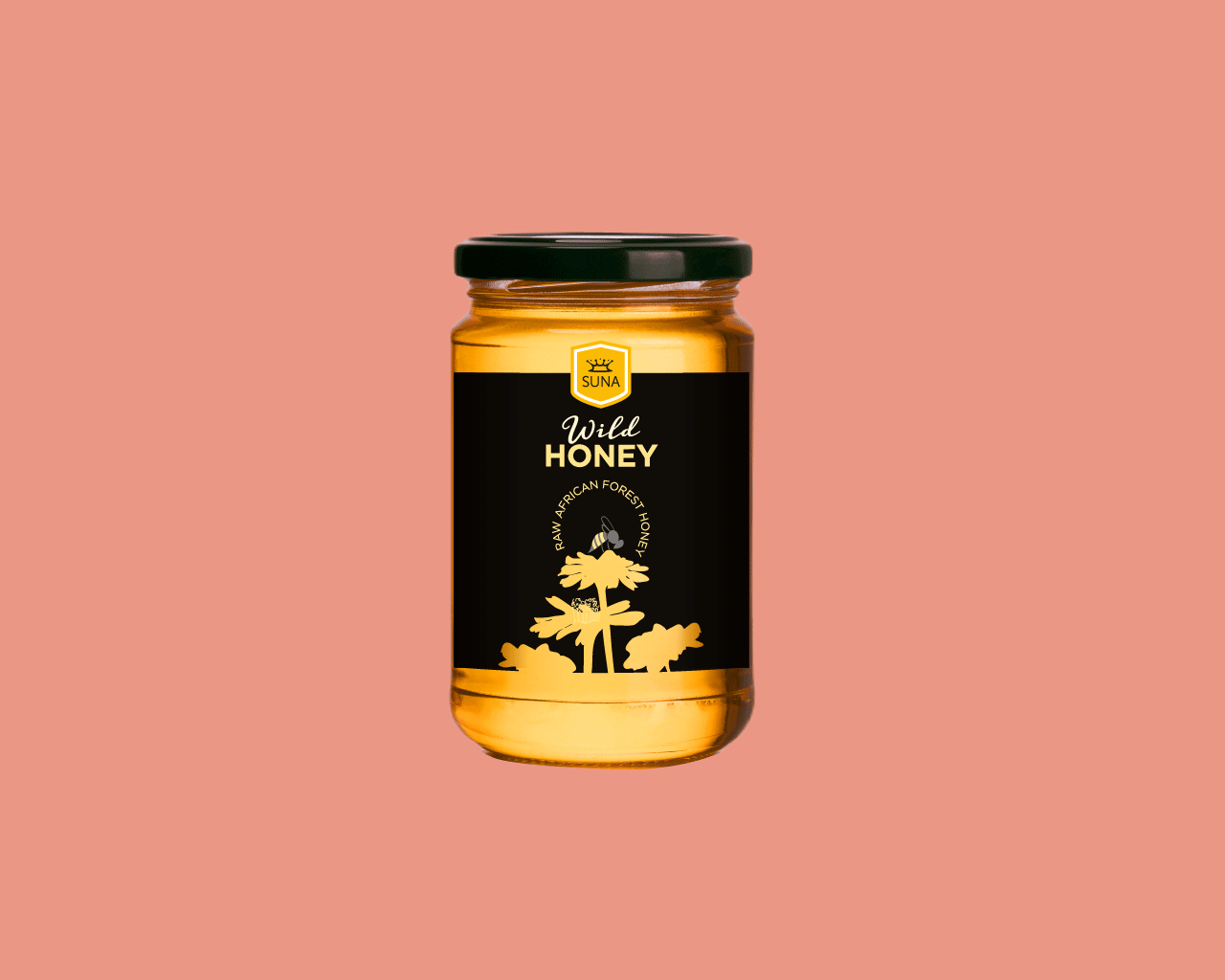
The honey label
SUNA has bee hives in a Tanzanian forest untouched by pesticides where bees roam free, producing honey from wildflowers in the forest. This creates a unique taste and premium honey. I presented three concepts, one of these was an option without the patterned dots. SUNA wanted a unique look, minimal yet premium and so I simplified the design to just a few colours from the main brand palette. Two labels were produced a yellow one and a black one. The black one felt more high-end as this colour is synonymous with premium aesthetics. I drew the illustration on a tablet. A worker bee rests on a wildflower collecting its pollen which it will turn into honey. The illustration is reflective of the lifecycle of honey, honey comes from pollen collected by bees. The flower shapes are cut out from the label to reveal the honey in the jar.
The outcome
The outcome
Getting SUNA off the ground has been met with a civil war in the region and a pandemic resulting in a slower than hoped-for start. Undeterred SUNA has soldiered on, the factory is being built the honey is being produced, uniforms have been printed, and the shop is being fitted out. SUNA is armed with all the brand elements it needs to have a successful launch. They are confident in the designs and empowered by the hopeful prospects it brings to them.
SUNA received an umbrella logo, brand guidelines, graphical assets, and packaging labels. I also designed food truck labelling, menu boards, in-store design layout, ice cream cups in multiple sizes, and a smoothie cup.
Selected Works
Vintage LABranding
Peace Starts HereCampaign
United Against RabiesWedsite design
Dogs for GoodCampaign branding and editorial design
SUNABranding and packaging
Your PlaceBranding
Rother District CouncilEditorial design
Whitworths FrootzPackaging

Royal College of PathologistsWebsite design
ICE Arts FoundationBranding
Flourish NowBranding
NHS photographyArt Direction
Healthcare for LondonCampaign branding and editorial design

B MagazineEditorial
Let's chat. You can reach me by email at rachel@ganeshwaran.com
© Copyright 2024 Rachel Ganeshwaran Design Studio
Let's chat. You can reach me by email at rachel@ganeshwaran.com
© Copyright 2024 Rachel Ganeshwaran Design Studio